Labels
- 3D (1)
- Animation (2)
- Character Design (8)
- Digital Painting (1)
- Layout (7)
- Life Drawing (11)
- Painting (3)
- Sketch Book (2)
Tuesday, 25 December 2012
Thursday, 29 November 2012
Monday, 19 November 2012
1920's Character Design
These design were inspired and influenced by HBO's Boardwalk Empire, if you haven't seen it, you should.
The corrupt politician, RotationLast pose sucks because I had to have a walking pose... had no clue what to do.
The Politicians henchman, Rotation
This guy carries out all of the politicians not so legal work, in a very rough and oafish fashion.
Ominous Exterior Painting
Recently was on a viking kick, read a few books, did some research, thus inspired this painting ... even though theres no viking in it, haha.
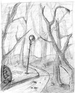
I was going for an ominous feeling in this scene, so i thought by making the layout gloomy and the trees look dead that the viewer would come up with their own story as to what happened to the viking.
Interior Study with Characters
The drawing, after many thumbnails I decided to go with the upshot because it gives the clearest visual to the little story going on.
My intention going in to this painting was to do something graphic, the top tonal is an attempt to create dramatic lighting while keeping it simple. The bottom tonal is more of a realistic attempt at rendering
Had a lot of fun doing these colour study's on the massive cintiq's at school. As much as i liked the top colour study I ended up sticking with my initial idea of a graphic style.
Painted with all the technical skill I could muster, still fell short of my projected expectation from the previous study's. Gouache with ink line art on top.
Saturday, 15 September 2012
Friday, 14 September 2012
Character in environment
Traditional painting done in gouache. Character is painted on a separate layer of acetate. One of the few traditional paintings I actually enjoyed doing.
Hands and Feet
Hand and Foot study's. Black and White pencil used on an earthy card stock. Started with hands trying to capture light and shadow to describe form.
Monkey Swag Walk Cycle
Original character walk cycle, background is half assed but it's all about the animation. Inspired by swag.
Flour Sack Archer
Final animation assignment in year one, liked how the action turned out so I took it to color. The spin is nicer in the pencil test, lost some frames when I was painting it at 5 in the morning.
Subscribe to:
Comments (Atom)


